Visualization of relationships
When looking into correlations and relationships the main display tool is the scatterplot.
You already know how to use the scatterplot from Chapter 4. From that chapter, you should also already know the criteria for a plot to meet the standards required for publication.
For the purpose of displaying a correlation and/or regression between two variables, the key consideration is if you assume one variable influences the other.
From Chapter 1, the section on Experiments, you learned that the variable that influences another variable is called the independent variable. The one variable that is affected is called the dependent variable.
If the purpose of your study does not involve assessing if one variable influences the other, then it does not matter what variable you use for the X- or Y-axis.
However, if your study assumes that one variable influences another one, the independent variable is located in the X-axis, while the dependent variable should be located in the Y-axis.
Let’s get to work in R. Let’s work on an interesting relationship I sow in the New York Times, between the people that voted for Donald Trump by State and the degree of higher education at those States.
First, download the two databases from Here and Here.
Next, load the data into R (remember Chapter 3, section about loading your own data).
TrumpVoters_by_State <- read.csv("D:/GEO380/Datasets/TrumpVoters.csv") #Fraction of people by State that voted for Trump
HigherEducation_by_State <- read.csv("D:/GEO380/Datasets/US-Pop-HigherEducation.csv") #Fraction of people by State that have higher education degrees
Next check the data were loaded correctly and review the structure of the data:
##        State TRUMPVoteAsFraction
## 1    Alabama              0.6208
## 2     Alaska              0.5128
## 3    Arizona              0.4867
## 4   Arkansas              0.6057
## 5 California              0.3162
## 6   Colorado              0.4325
Review the same for the second database:
##        State BachelorDegreePerStateAsFraction
## 1    Alabama                            0.087
## 2     Alaska                            0.101
## 3    Arizona                            0.102
## 4   Arkansas                            0.075
## 5 California                            0.116
## 6   Colorado                            0.140
The data appear to have loaded correctly. But I have the data I want in two different data.frames, so I have to merge them. In this case, I have one variable in common to the two data.frames that I can use to merge them by; that is the variable State. So, let’s merge our two data.frames by State.
p i
When merging databases, things can get tricky as you need to have at least one column in common to merge by. You need to ensure that in both databases, each field uses the same names for the data.
For instance, say you have a common column call state, but in one database the data are shown by full names but in the other by abbreviate name.
In this case, the merge function will return an empty database, because the two databases do not have variables that can be matched.
In such cases, you need to modify the original databases to ensure the two data.frames share a common variable, with similary named data.Let’s review the new merged database: u
##        State TRUMPVoteAsFraction BachelorDegreePerStateAsFraction
## 1    Alabama              0.6208                            0.087
## 2     Alaska              0.5128                            0.101
## 3    Arizona              0.4867                            0.102
## 4   Arkansas              0.6057                            0.075
## 5 California              0.3162                            0.116
## 6   Colorado              0.4325                            0.140
Ok, now lets plot the data. In this case, I think the fraction of people that voted for Trump could be function of how educated they were, not the other way around; that would be like saying that Trump affected the degree of education of each State….hmm…when I say like that is does not sound that unlikely, ah?.
This distinction is important because you need to determine which variable goes in the Y axis, and which one on the X-axis.
If I think, the votes for Trump were influenced by the level of their education, them level of education will be the independent variable and then it will be located in the X-Axis. In this reasoning, The percent of the State’s population that voted for trump will be the dependent variable, and so, it should be located on the Y-axis. Lets do that plot:
plot(Data$TRUMPVoteAsFraction~Data$BachelorDegreePerStateAsFraction, ylab="Trump voters by State (Fraction)",xlab="High degree education (Fraction of population)")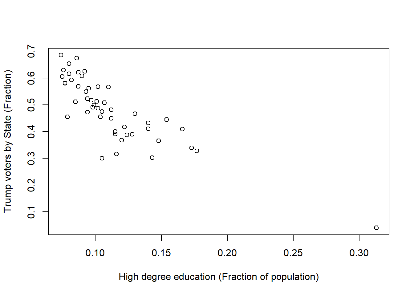
Hmm, from this visualization alone you can tell something is cooking here…the least educated states voted for Trump more so than States with more educated populations. Let’s explore this relationship in more detail, as a case example.