Animated plots
What about animated plots?. If you recall the database on socio-economic data from countries in the world, you will notice that each variable was collected at different years. What year to display?. Well you can display them all and see how any pattern will change over time using an animated plot that displays each year sequentially. For animated plots, we will use the ggplot2 and the gganimate libraries/packages. i
#first lets bring the data.
ExpectancyData=read.csv("https://raw.githubusercontent.com/Camilo-Mora/GEO380/main/Datasets/Countries_LifeExpectancy.csv")
GDPData=read.csv("https://raw.githubusercontent.com/Camilo-Mora/GEO380/main/Datasets/Countries_GDP.csv")

#lets merge those two databases, using the dplyr packaged that we used earlier.
library(dplyr)  #load package to merge database

#merge the databases
MergeData <- full_join(GDPData, ExpectancyData, by = c("country","year"))
As it is customary, lets check the data were loaded and display correctly.
##       country continent.x year gdpPercap    X continent.y lifeExp
## 1699 Zimbabwe      Africa 1982  788.8550 1699      Africa  60.363
## 1700 Zimbabwe      Africa 1987  706.1573 1700      Africa  62.351
## 1701 Zimbabwe      Africa 1992  693.4208 1701      Africa  60.377
## 1702 Zimbabwe      Africa 1997  792.4500 1702      Africa  46.809
## 1703 Zimbabwe      Africa 2002  672.0386 1703      Africa  39.989
## 1704 Zimbabwe      Africa 2007  469.7093 1704      Africa  43.487
It seems data were loaded fine. The three variables of interest here are gdpPercap (GDP per capita), lifeExp (life expectancy), year and continent. (note that continent is double, because that column was on each of the dataset we merged, and we did not specific to do the merging by continent as well).
Lets create an animated plot of that data. Since the code needed will require several lines, it is recommended that you create the code in Tinn-R firts. Once it is done, copy and paste in the R console.
# for the figures we will need
    library(ggplot2)      #this package is to do all sorts of plots
    library(gganimate)    #this package does the animation

# Make a ggplot, but add frame=year: one image per year
    ggplot(MergeData, aes(gdpPercap, lifeExp, color = continent.x)) +
      geom_point() +
      scale_x_log10() +
      theme_bw() +
# gganimate specific bits:
      labs(title = 'Year: {frame_time}', x = 'GDP per capita', y = 'life expectancy') +
      transition_time(year) +
      ease_aes('linear')

# Save at gif:
    anim_save("AnimatedPlot.gif")
The code above generate the plot below, which should now appear in your working folder.
You can find out your working directory by typing getwd() in your R console.
You can also set the working folder to a different path using the setwd(); in between brakets you put the path to the folder you want R to deposit any result from your codes.
For instance, setwd(“D:/GEOG380”), sets my working directory to a folder called GEOG380 in my D harddrive.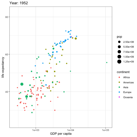
Figure 4.5: Animated R plot