Density plots
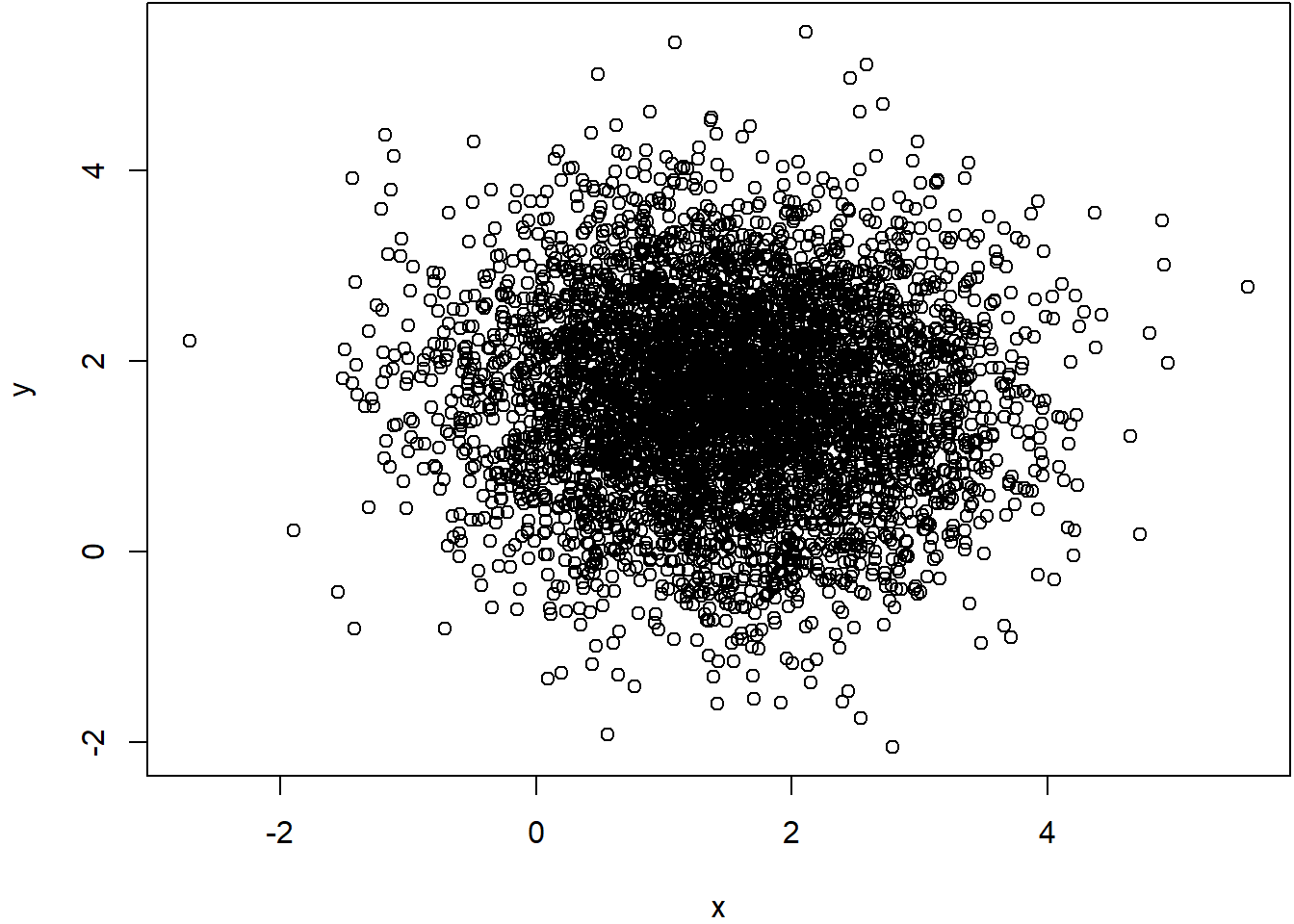
At times, when you use scatterplots with many data points, chances are that some points will overlap, and then create a misleading visual representation of the data as any overlapping data points will appear as a single point.
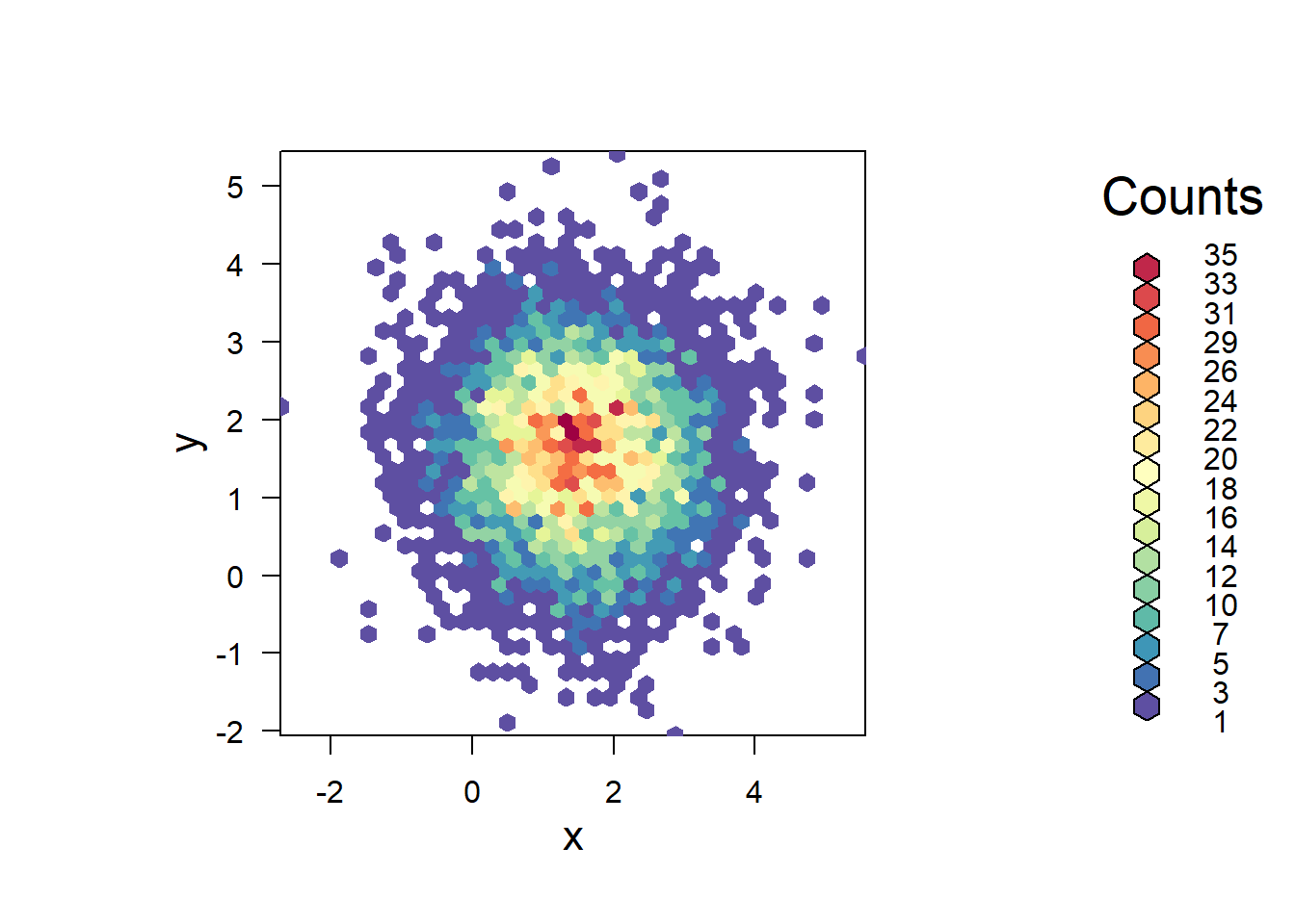
A better representation of the data in this type of case is the use of density plots, in which the space of the entire plot is gridded into equal size cells, and the number of point overlapping on each cell counted and that is what is displayed. Let’s do an example.
#lets create a dummy dataset of many points
# Create data
x <- rnorm(mean=1.5, 5000)
y <- rnorm(mean=1.6, 5000)

#lets plot that data
plot(y~x)
From the figure above you can tell that it is hard to make sense of any pattern because many points overlap. One solution to this is to use a density plot. And there are different packages to do so. Here we will use the hexbin package.
## Warning: package 'hexbin' was built under R version 4.4.3library(RColorBrewer) #This library allows you to create color scales, we will see this later.
# Make the plot
bin<-hexbin(x, y, xbins=40) #hexbin is the function to grid the points in the plot. You can use different number of grids.
my_colors=colorRampPalette(rev(brewer.pal(11,'Spectral'))) #this is the color scale
plot(bin, main="" , colramp=my_colors , legend=F ) #now lets plot the hexbin/grid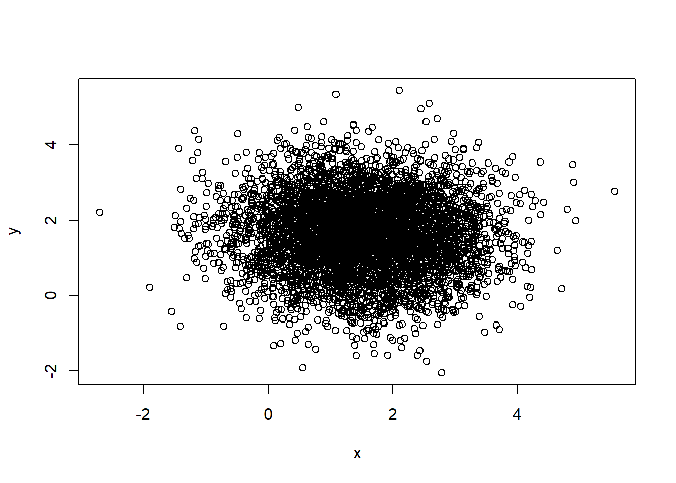
Now you can see the same data, but plotting the hexbin/grid. You can play with different settings of the hexbin package, by typing ?hexbin in the R console.
You can also display both plots side by side using the par function.