Scatterplots
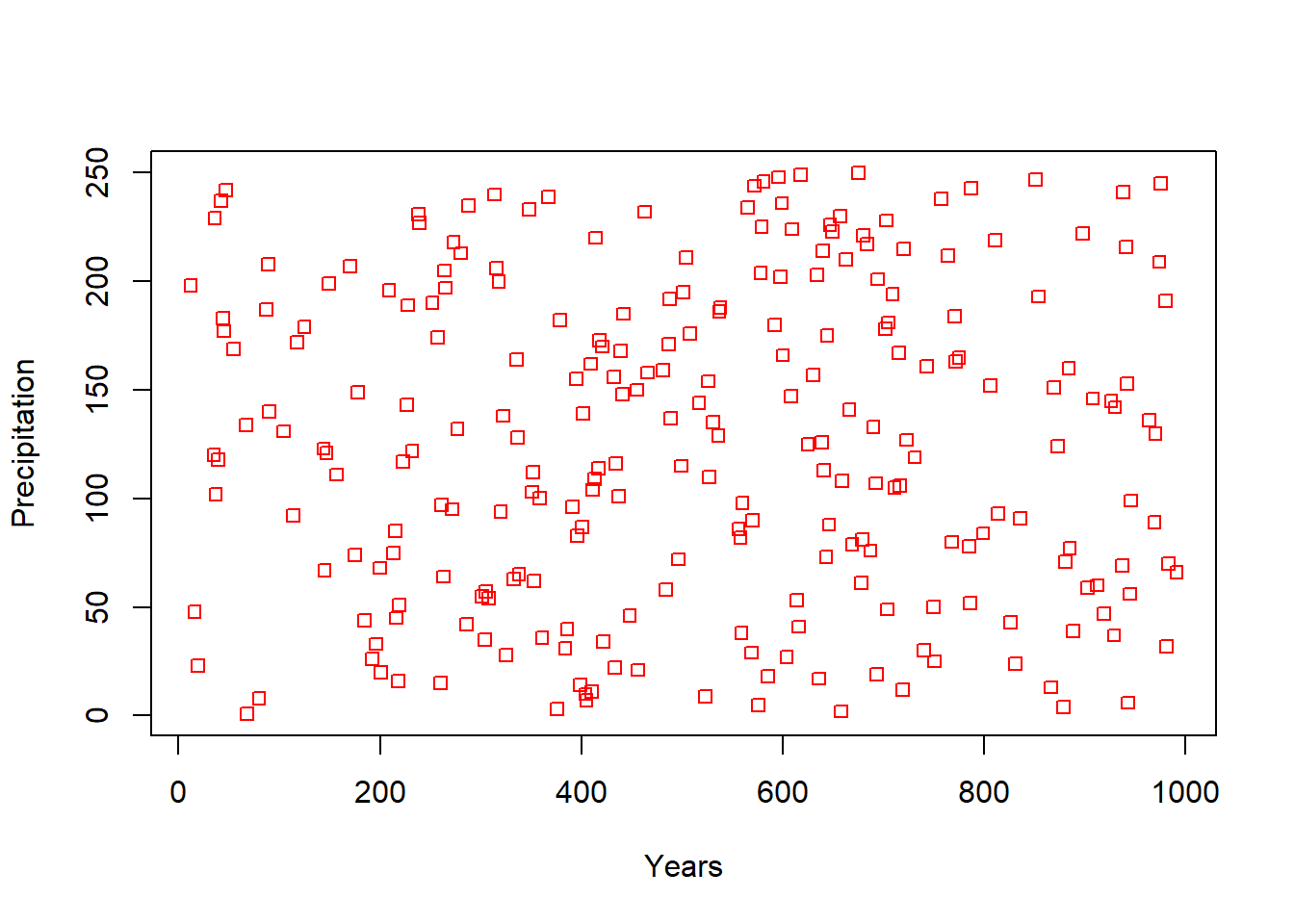
Scatterplots allow you to see patterns of variation between two variables. To create a plot in R, simply type plot(y~x). Lets say I want to plot the second and third column in a dataframe.
#Lets create some dummy data
DataFrame<- data.frame( x1 = c(rep(1,250)),     # in Column 1 I repeat the number 1 for 250 times
                        x2 = seq(1:250), #Column 2 I create a sequence of numbers from 1 to 250
                        x3 = sample(seq(1:1000),250)) # select 250 random numbers between 1 and 10000
#Now lets plot columns 2 and 3 of that data
plot(DataFrame[,2]~DataFrame[,3])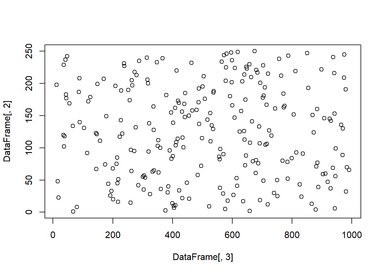
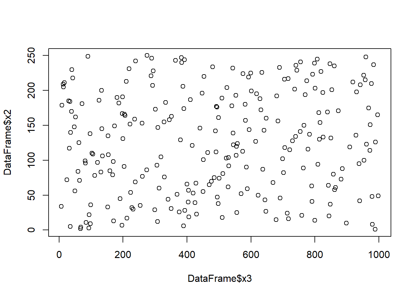
#You can also plot by column name using the $ sign as indicated earlier to call a column
plot(DataFrame$x2~DataFrame$x3)
Now it comes the different settings needed to format the figure. Almost any attribute of a figure in R can be formatted.
Next, I will show you how to format a few parameters. Once you know how to format a given parameter of a figure, you should be able to format any other parameter. Obviously a figure has tens of parameters you can modify, so you should not expect to know them all by memory, but you should be able to know how to find the given parameter, which by now you know it is by asking your friend Google.
Let’s modify a few parameters from the figure above.
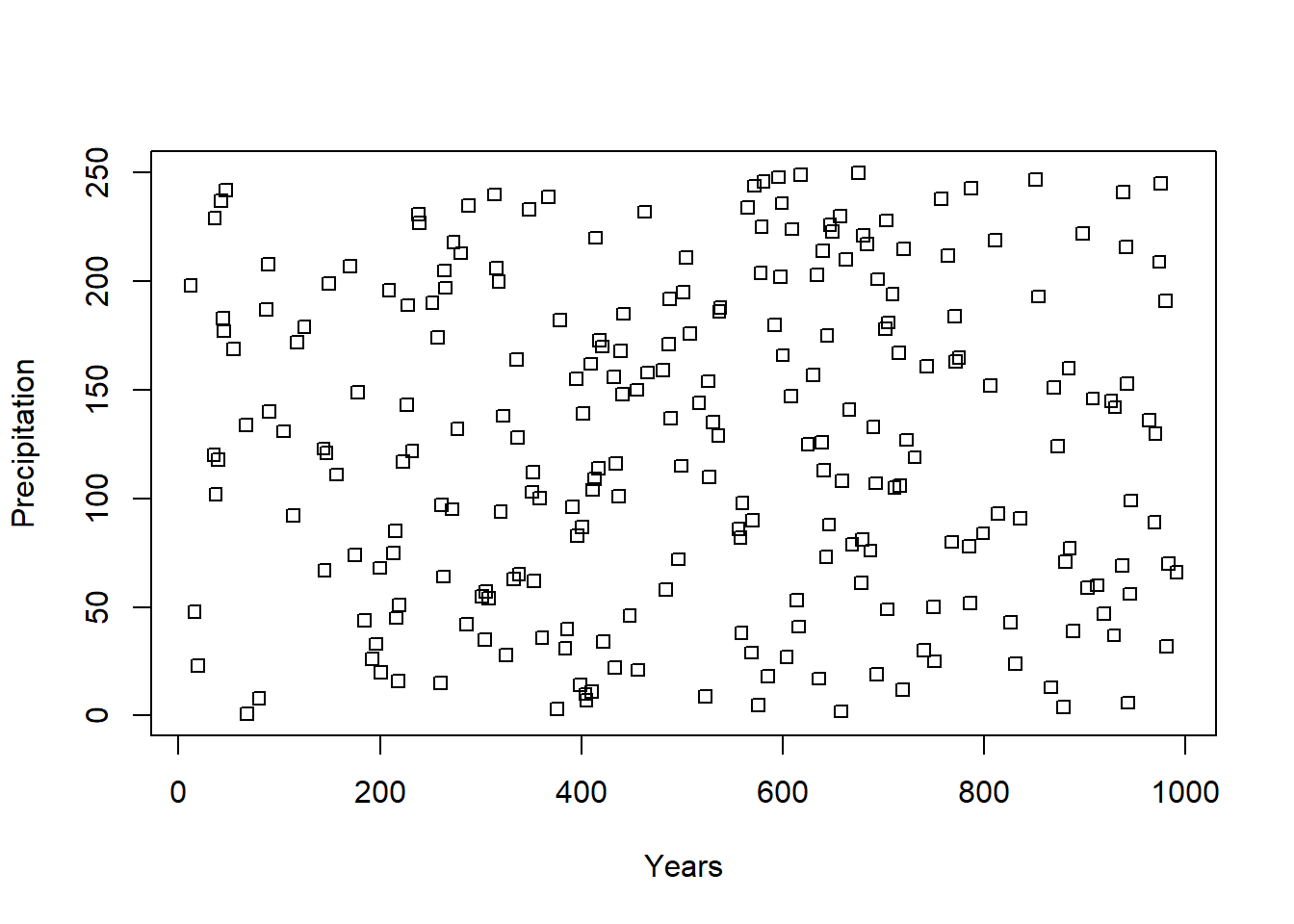
For instance, what about the axis names? You can add axis names using the command xlab or ylab inside the plot command, like this:
What about the different type of symbols?
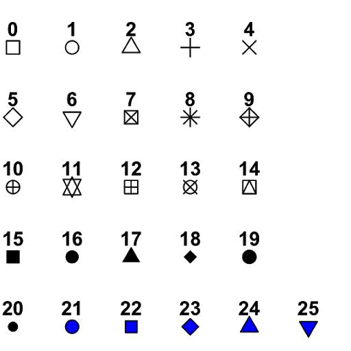
Figure 4.3: R plot symbols
R offers 25 different symbol types (Figure above), which you can call using the parameter pch, like this:
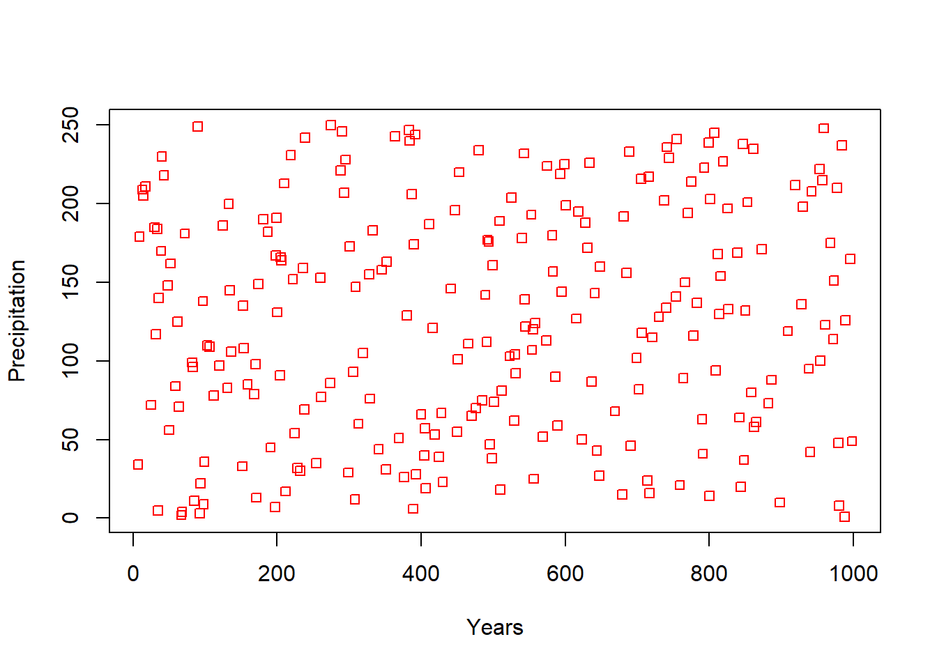
What about colors for those points?. That is controlled using the col parameter. Like this,
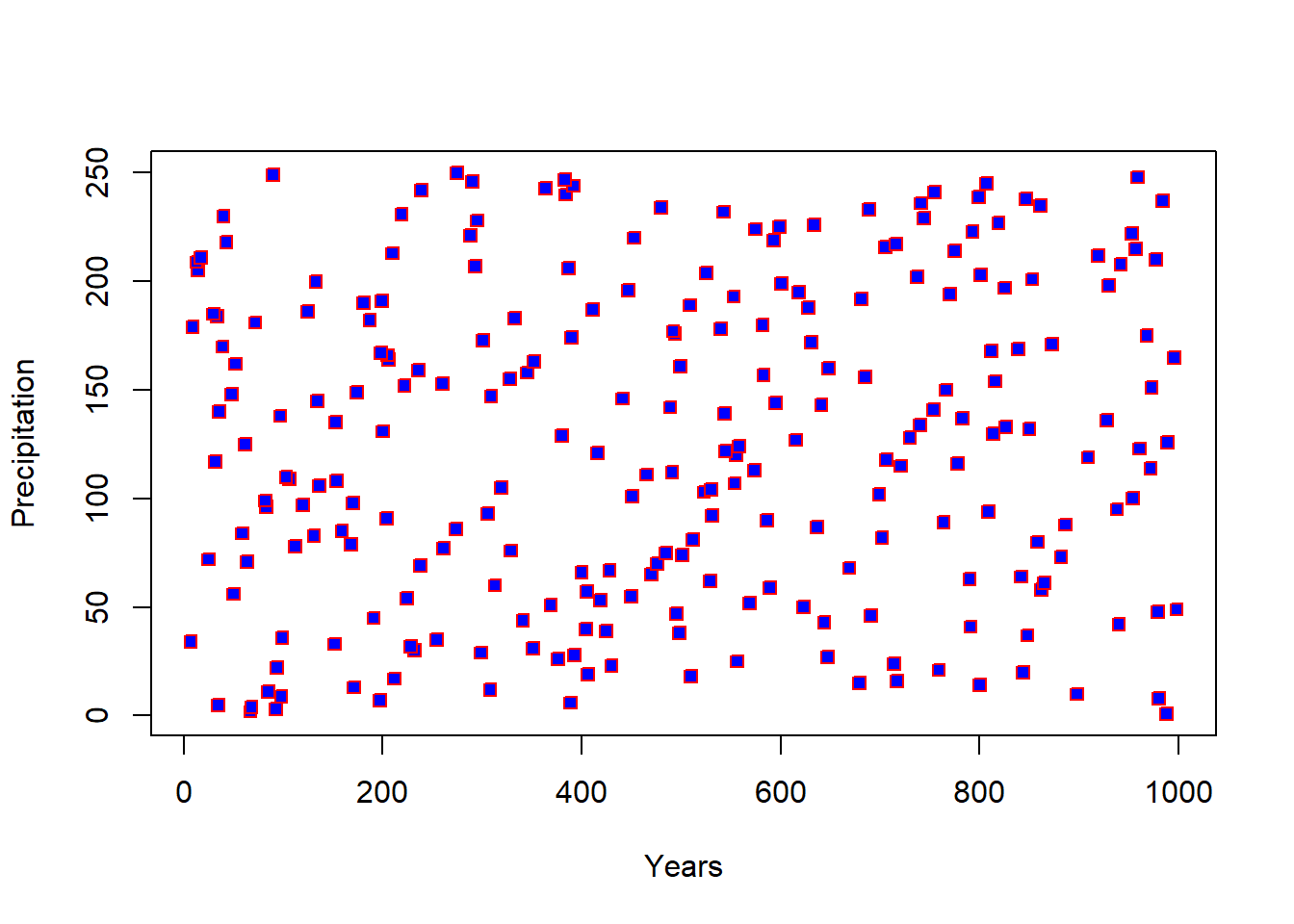
For some symbols you can also control the filling color, using the bg parameter. Like this,
You can also control the size of the symbols using the cex parameter. Like this,
Remember, there are tens of parameters you can modify in a plot. So you need to know exactly the standards required in the journal you want to publish to ensure you deliver the best figures required.