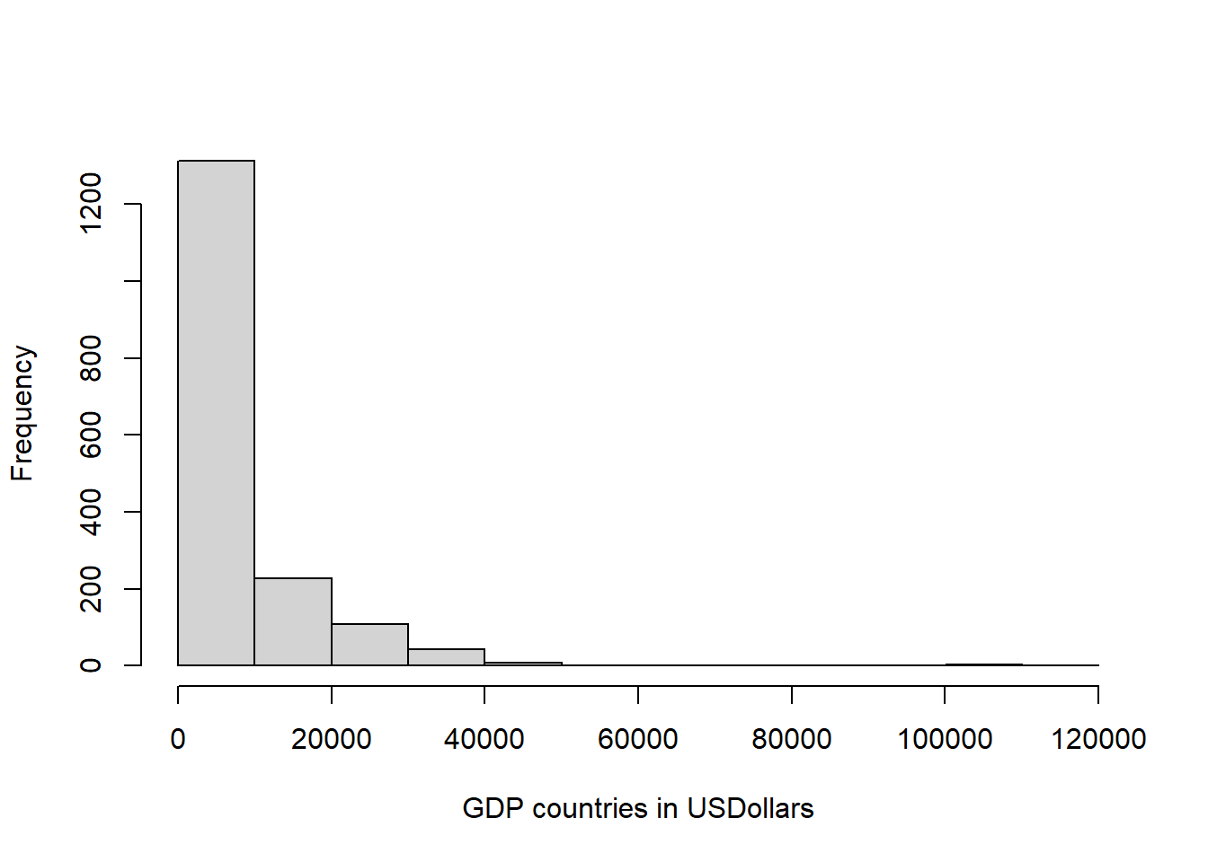
Histograms
Histograms are a very important type of plot as it lets you see the frequency in which certain values appear in your data. This type of plot is also call a frequency distribution. To create a histogram in R, you use the command hist(x), where x, is the vector of data you want to plot.
Lets create a frequency distribution of the GDP (Gross Domestic Producto) of countries in the world, using the csv file we loaded earlier,
#lets reload the data, just in case you have not loaded it
GDPData=read.csv("https://raw.githubusercontent.com/Camilo-Mora/GEO380/main/Datasets/Countries_GDP.csv")

head(GDPData)   #now lets check the data
## country continent year gdpPercap
## 1 Afghanistan Asia 1952 779.4453
## 2 Afghanistan Asia 1957 820.8530
## 3 Afghanistan Asia 1962 853.1007
## 4 Afghanistan Asia 1967 836.1971
## 5 Afghanistan Asia 1972 739.9811
## 6 Afghanistan Asia 1977 786.1134
Just as with the scatterplot, you can improve the appearance of the figure. Lets start with the axis name.
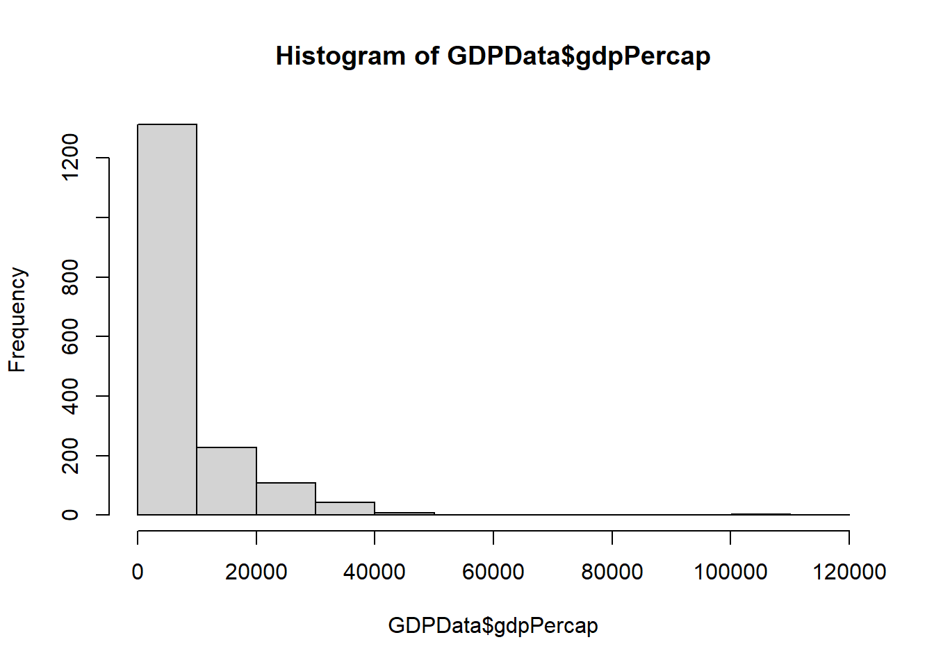
What about that title?. Not pretty, ah?. That is a default in R. To remove it, we set the “main” parameter to NULL, like this:

Most journals do not allow you to put tittles in your plots.
If you want to rather keep the tittle, but have a different tittle, you replace NULL with the title you want, like this: