4 Basic plots
Making good quality plots is fundamental to the successful delivery of a scientific finding. The best story is the one that can be told with figures o.
Not surprising, making good figures is a demanding endeavor of the scientific process, and there are at least two steps to it.
First, you need to decide on which type of figure best illustrates the point that you what to make. It is not about deceiving the reader, but rather use the most convincing available figure. Of course, each problem will have different needs, so you just need to be familiar about the different types of figures available, to better know which is the best figure for your own case problem.
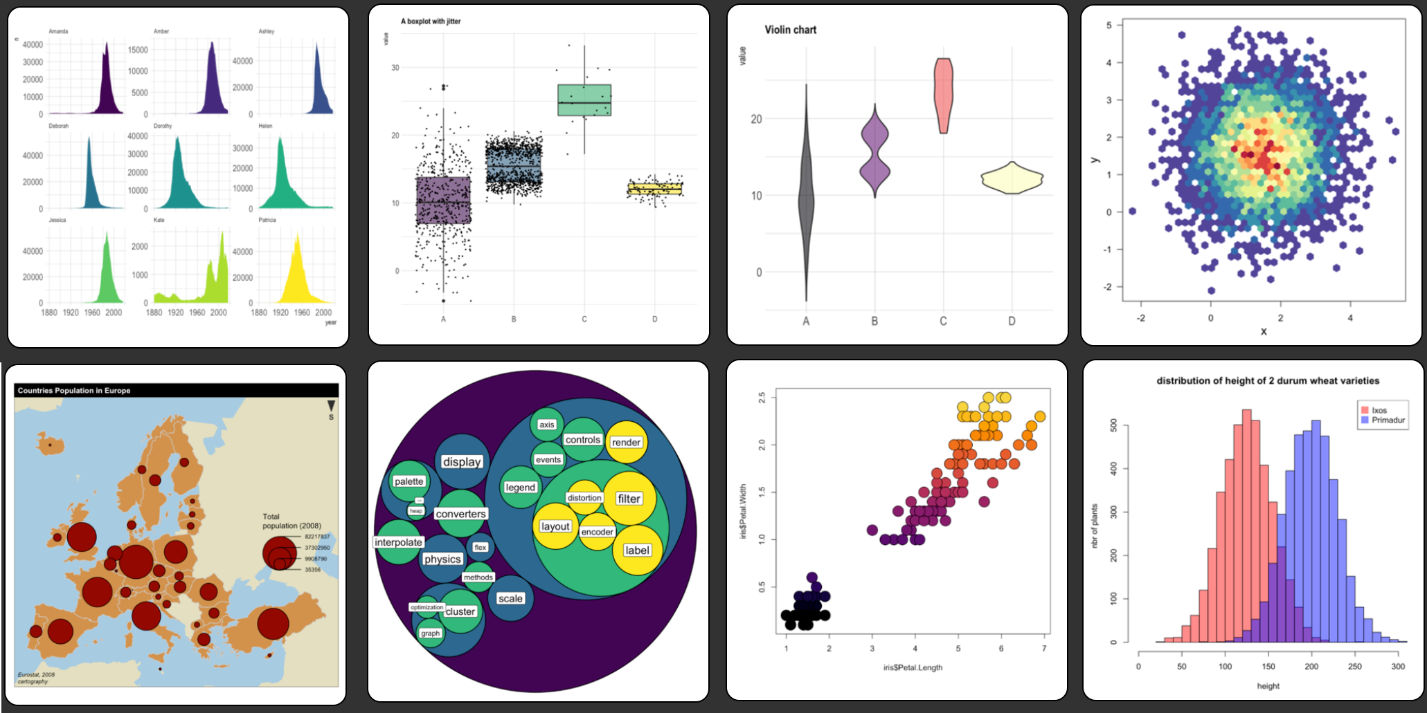
Figure 4.1: R plots
R has several built-in functions to do all sorts of plots. You can even create your own types of plots. Some packages even allow you to create plots online, where people can interact with the data. Others let you animate the data.
You can check a gallery of R plots here.
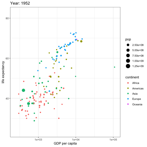
Figure 4.2: Animated R plot
Second, it is the issue of the standards of the figure. This relates to the editorial guidelines you need to follow to deliver your figure.
Each scientific journal has different guidelines for figures.
Some journals allow you to place multiple figures together, others like the letters to be of a given size and font type, other journals only like black and white, others want the figures on certain dimensions, etc.
So you need to know the guidelines that are specific to the journal you want to publish on to ensure your figures are up to standard.
If you are not publishing a paper, it will still be good for you to follow the guidelines of figure formatting for any journal, so you know your figures are up to the most professional standards required in the field.
Regardless of the guidelines for the specific journal, it is important that your figure is clear enough to be understood. Here are some key conditions for any figure:
Ensure that the axes have names. e.g. Human population.
Ensure that between brackets the axes have units. e.g. Human population (Number of people)
Ensure that your axes have tickmarks.
Ensure all data are displayed. If you constraint the values shown in your axes, be sure you do not remove data by accident.
Ensure the lines of the axes are black color. At times the axes colors are grey. The problem with this setting is that when printed, such axes may not appear, depending on how good your printer is.
Ensure the thickness of the axes is at least 1 point. At times the lines are thin, and this creates problems with printing as well.
When possible use black and white for your figures. While color is very common, many people take photocopies of papers or reports and they are very common in black and white. So in those cases any color figure will have troubles.
p
Lets check how to do some of the most common types of plots in R.