Candlesticks
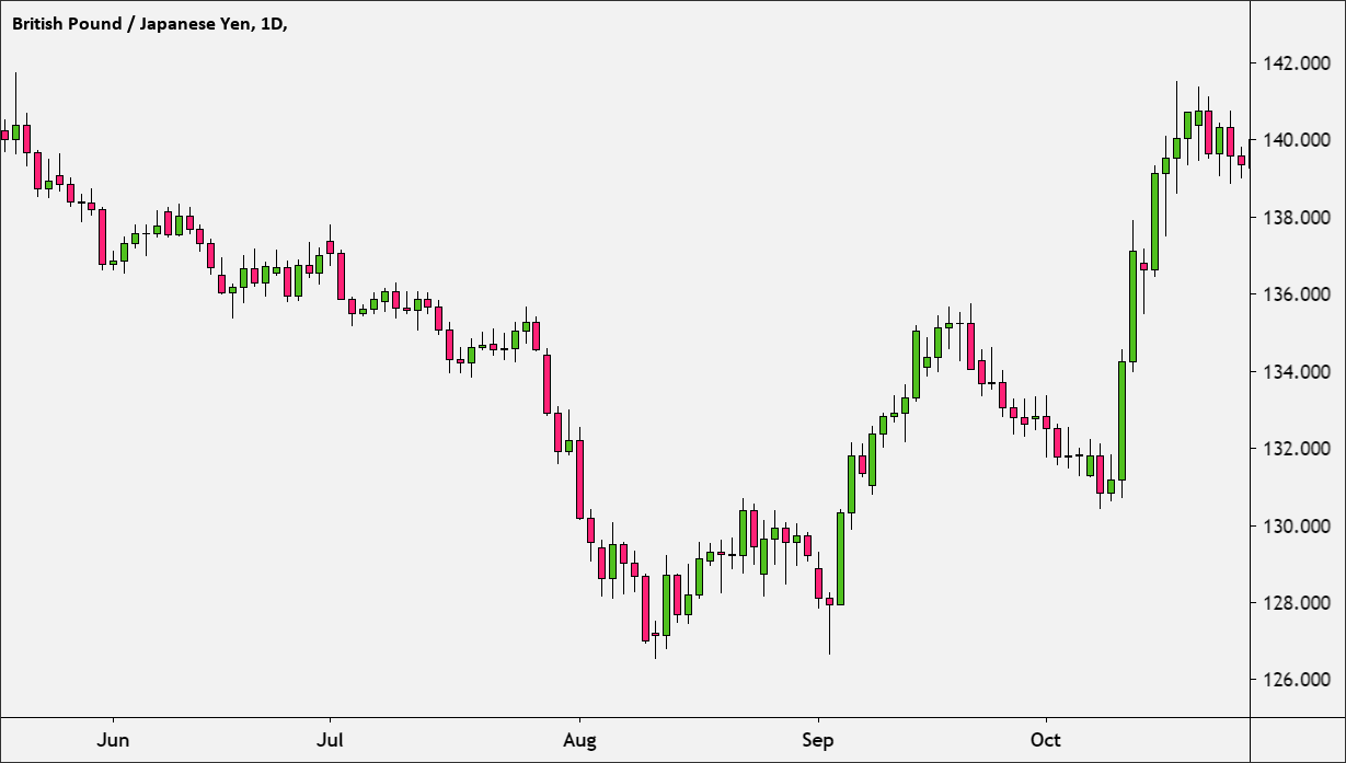
One way to visualize the trading data is to summarize it in what is call a candlestick chart.
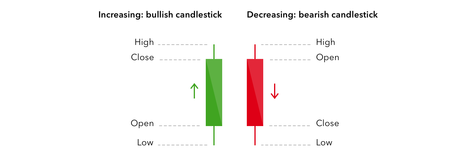
Basically, the data over a given time period is summarized as the maximum and minimum value of the stock, the price at the start (also called “Open”), and the price at which the stock ends in the given time period (also called “Close”).
The maximum and minimum are shown as a vertical line, also called a “shadow”.
The open and close are shown as boxes, also called “body”.
If the close is lower than the Open, (the stock when down in price during that time), the body is colored red.
If the close is higher than the Open (The price when up), the body will be colored green.

Figure 2.19: Candlestick

Figure 2.20: Candlestick chart